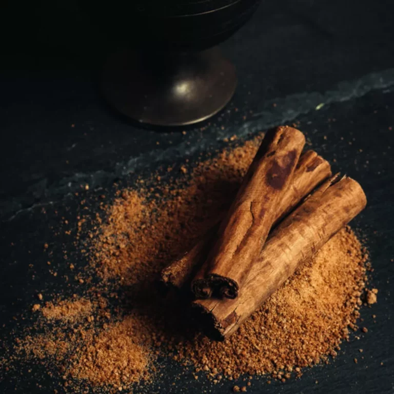
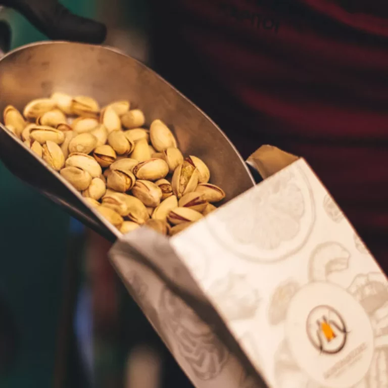
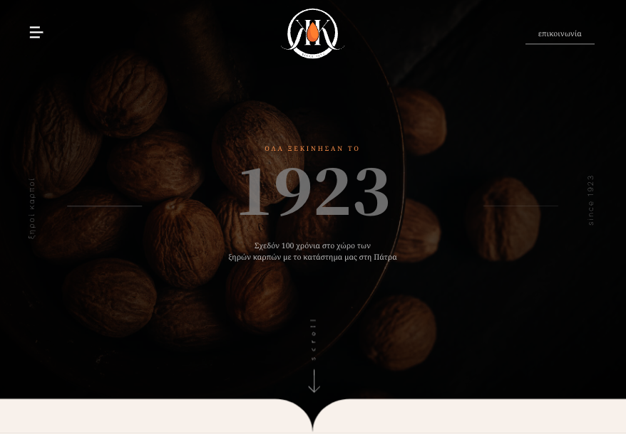
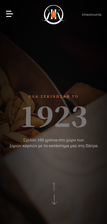
Kontratzis nuts was founded by xristos kontratzis in 1923 with all the passion and knowledge mr Xristos had about nuts. With the same passion Rubik Solutions envizionized and designed the brand’s new, digital era. Colors, as brands first representative, were chosen for the purpose of giving the feeling of trust and a long time presence in the indusrty. A light brown color gives the feeling of a time where each single nut was treated with care exactly as we treated the logo creation process. An opal light yellow breeds the sense of every fresh nut that just got harvested.
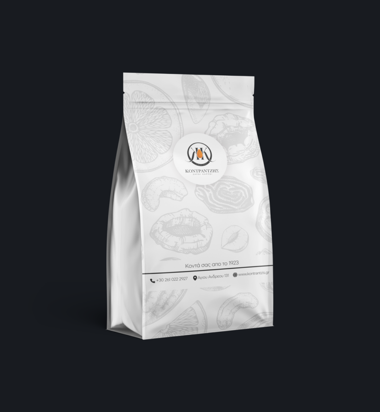
Web design was based on a classic with edges typography fitting every text color in the new brand’s color palette making everything blend into the designs seamlesly. Using smooth transitions and calm animations we give each visitor the feeling he can live the experience of shopping fresh nuts from the comfort of his own home. As tradition follows the ages, we even implemented daily recipes in which any customer could use the goods he jsut purchased as the main ingeredients. Packaging design followed and very delicant and vintage package was made excacty based in the needs of the brand.